Imagine you have a giant puzzle. Each piece is a number, a fact or a trend. Alone, they don’t mean much but when you fit them together, they reveal a hidden picture. That’s what Data Analytics and Visualization Specialization is all about, teaching you how to solve puzzles with data and turn them into stories everyone can understand. Whether you’re curious about how Netflix recommends movies or how businesses predict trends, this course is your magic wand to unlock the secrets behind the numbers. Let’s dive into how this course can transform you into a data wizard.
About the Course
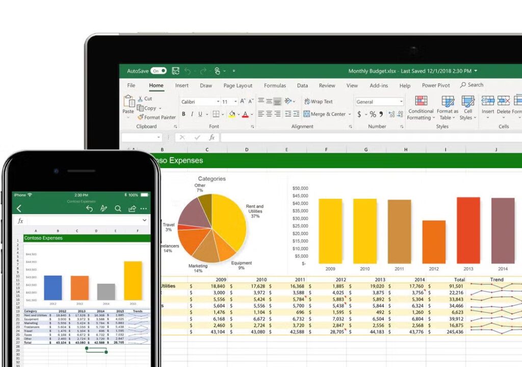
The Data Analytics and Visualization Specialization is designed for anyone who wants to speak the language of data fluently. Think of it as a friendly guidebook that walks you through the world of numbers, charts and graphs. No prior expertise? No problem. This course starts with the basics, like how to collect and clean data (yes, data needs “cleaning” too!) and gradually takes you to advanced topics like creating eye-catching dashboards and predicting future trends. Perfect for students, professionals or even hobbyists, this course turns raw data into meaningful insights using tools like Python, Excel, Tableau and Power BI. By the end, you’ll not only analyze data but also present it in ways that even your grandma would find fascinating
Key Skills You Will Develop
By the end of this course, you’ll wear multiple hats, a detective, an artist and a storyteller. You’ll learn how to spot patterns in messy data, like finding hidden treasures in a cluttered room. Skills like data cleaning will teach you to organize information neatly, while statistical analysis will help you uncover truths buried beneath the surface. Visualization tools like Tableau will turn you into a digital Picasso, transforming rows of numbers into colorful charts and interactive dashboards. Most importantly, you’ll master the art of storytelling—explaining complex data in simple, engaging ways that persuade and inspire action. Whether it’s predicting sales trends or tracking climate change, you’ll turn data into decisions.
What You Will Learn?
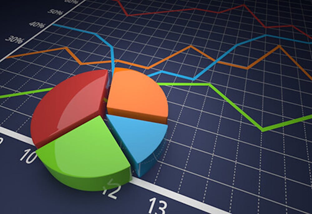
This course is a journey through the entire lifecycle of data. You’ll start by learning how to gather data from surveys, websites or sensors, like fishing for the right pieces of a puzzle. Next, you’ll clean and organize this data, removing errors and duplicates (think of it as tidying your room before guests arrive). With tools like Python and R, you’ll dive into statistical analysis, discovering trends and relationships, such as why ice cream sales spike in summer. Then comes the fun part visualization. Using platforms like Tableau and Power BI, you’ll design stunning graphs, heatmaps and dashboards that make data come alive. Advanced modules will introduce machine learning basics, teaching you how to predict future outcomes, like forecasting tomorrow’s weather using today’s data. Along the way, real world projects (e.g., analyzing social media trends or business sales) will sharpen your skills, ensuring you’re ready to tackle any data challenge.
Why Choose This Course?
Beginner-Friendly: No coding or math genius required—just curiosity!
Hands-On Learning: Build projects you can showcase in portfolios or job interviews.
Industry-Standard Tools: Master Python, Excel, Tableau and Power BI—the tools pros use daily.
Flexible Pace: Learn at your speed, whether you’re a student or a working adult.
Certification: Earn a credential to boost your resume or LinkedIn profile.
Supportive Community: Join forums to ask questions and share ideas with peers.
In a world drowning in data, this course teaches you to swim—and maybe even surf!
Related Post – By Expert Google Data Analytics Professional
Why “Data Analytics and Visualization Specialization” Matters
Data analytics and visualization are essential for driving innovation, optimizing operations, and achieving business success. This course matters because:
- Data-Driven Decisions: It enables learners to interpret complex data and make decisions backed by evidence.
- Improved Communication: Visualization techniques make it easier to share insights with non-technical audiences.
- High Demand for Skills: With the rise of big data, organizations are actively seeking professionals skilled in analytics and visualization.
- Broad Applications: The skills gained in this course are applicable across industries, from marketing and finance to healthcare and technology.
Why Choose This Course
Comprehensive Curriculum
The course covers the entire data analytics and visualization pipeline, making it suitable for beginners and professionals alike.Hands-On Projects
Real-world case studies and practical exercises allow learners to apply their skills and gain confidence.Expert Guidance
Taught by experienced professionals, the course offers insights into industry practices and trends.Career Opportunities
Skills in data analytics and visualization are in high demand, and this course enhances your employability and career prospects.Flexible Learning
With self-paced modules, you can learn at your convenience and revisit concepts as needed.
Final Thought
Data is everywhere—from the apps on your phone to the traffic lights on your street. The Data Analytics and Visualization Specialization doesn’t just teach you to understand data; it empowers you to speak its language and share its stories. Imagine helping a company reduce waste, a hospital improve patient care, or a city plan better schools—all by decoding numbers. This course isn’t just about charts and algorithms; it’s about making a difference. So, whether you’re dreaming of a high-paying tech career or simply want to impress friends with cool data tricks, grab this opportunity. The world needs more data storytellers, and you could be one of them. The data driven storytellers always brings authenticity. So, Go with this course it will help you a lot.
For Registration –
FAQs
This course is perfect for students, professionals, and entrepreneurs who want to understand data analysis and visualization. No prior experience is required, but basic knowledge of data handling is a plus.
The course covers tools like Tableau, Power BI, Excel, and Python libraries (Matplotlib, Seaborn, Pandas), depending on the platform offering the course.
Most learners complete the course in 20–30 hours, but the self-paced structure allows flexibility based on your schedule.